Accordions
Groups related long content into sections shown one at a time
Accordion


Overview
Anatomy
Core elements
- Caret: Identifies when the accordion is open or closed. Pointing down in open. Pointing right is closed.
- Title: Identifies the title of the accordion.
- Description: Additional text to provide context to the accordion content.
- Body: Contains the content of an accordion.
Optional header elements
- Description: Additional text to provide context to the accordion content.
- **Info icon: **Offers additional contextual information to the accordion content on hover/click with a tooltip or modal.
- Counter: Counts the number of items, or number of items that require action inside the accordion.
- Badge: Presents users with short, important information that should be distinguished from the rest of the display.
- Menu icon: Allows for access to multiple controls from a single trigger.
Variants
- Background
- No background
- Chevron left
- Chevron right
Guidelines
When to use
- You have long sections of content with similar structure, such as employees within teams.
- You want to show only one section at a time (to keep users from being overwhelmed to support progressive disclosure).
When not to use
- You want to display all content on the screen at once—use a card.
- Each section has a single associated action—use a tile.
- The information to hide is simple and doesn’t have a repeating structure—use a collapse.\
📱 Mobile Considerations
- Accordion components should span the full width of the screen or a full-width container within screen margins.
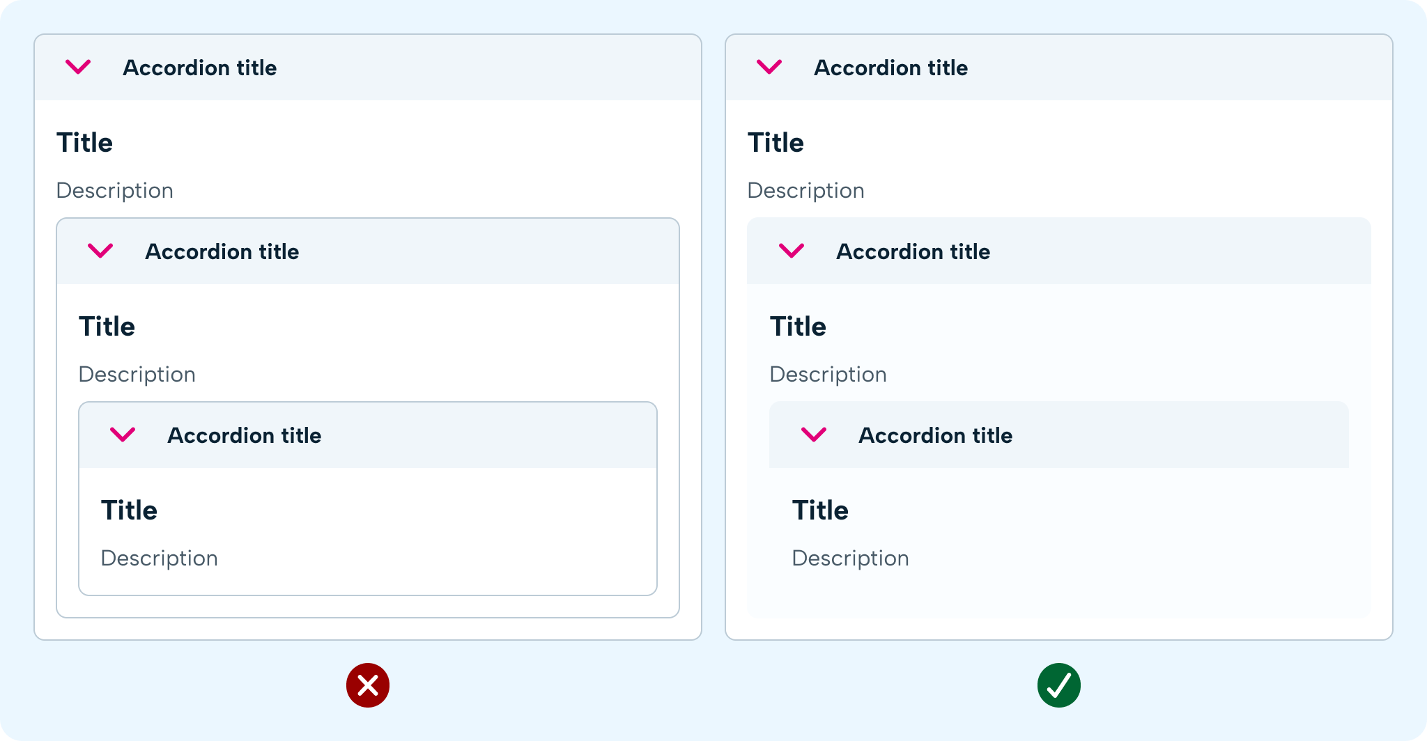
- Avoid using nested accordions, as this can be difficult to navigate on smaller screens.
Behaviour
States
An accordion can be expanded or collapsed — this is a visual affordance. In addition, accordions have 2 interactive states that may affect the visual output. Available interactive states: default and focus.
To do
Accessibility
Keyboard navigation considerations:
Links must be keyboard accessible via the Tab key, show a clear indication when a header is selected and opened by pressing the Enter or space key. If a panel is collapsed the content of this must not be focusable by a keyboard until expanded. The contrast ratio of focus indicators and the background must be at least 3:1
Screen reader considerations:
- The accordion title should have a label to indicate that it can be clicked to open.
- Accordion button should be usable via keyboard or screen reader
- Content should be hidden when not visible
- Make use of appropriate aria-hidden aria-expanded tags
Visual considerations:
The contrast ratio between text on the accordion and the background must be at least 4.5:1 Users should be able to resize the accordion up to 200%.
Outlined Accordion Usage Guidelines:
When to use
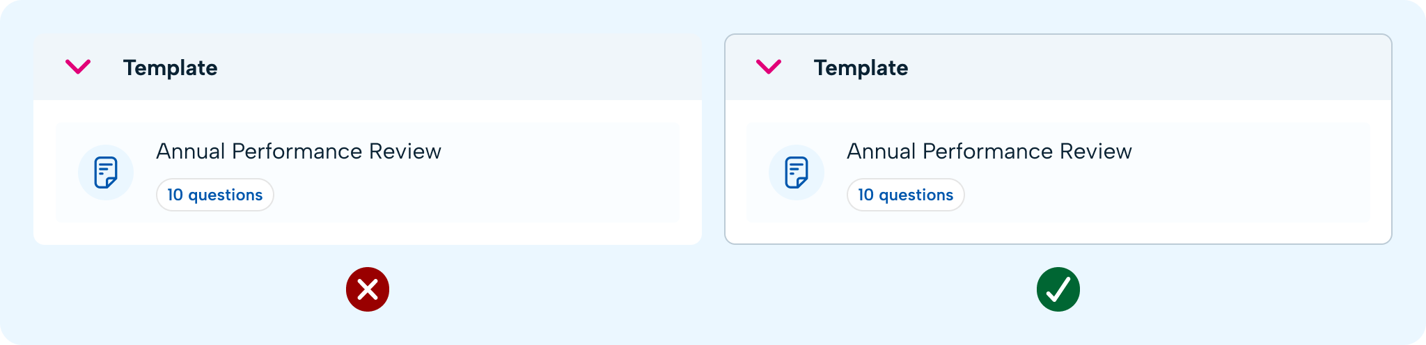
Low Contrast Backgrounds
- Scenario: When the accordion is placed on a non-white background where the contrast between the header fill and the background is insufficient.
- Reason: The outline helps to clearly delineate the accordion from the background, ensuring better visibility and accessibility.
Grid Layouts
- Scenario: When accordions are used in a grid format and require borders to differentiate between sections.
- Example: In Employee Profile > Employment, where multiple accordions are displayed in a grid.
- Reason: The outline provides a clear separation between different sections, improving the overall organisation and readability of the content.
When not to use
Nested Accordions
- Scenario: When an outlined accordion is nested within another outlined accordion.
- Reason: Using multiple outlined accordions within each other can create a cluttered and visually overwhelming interface. It is better to use a non-outlined accordion in such cases to maintain a clean design.