Modal
Last update: 8 Apr 2025
OVERVIEW
Definition
Modals are temporary UI overlays that require user interaction before proceeding. A modal is used to reveal critical information, show information without losing context, or when the system requires a user response.
Live Demo
/[ Add Storybook ]
Anatomy
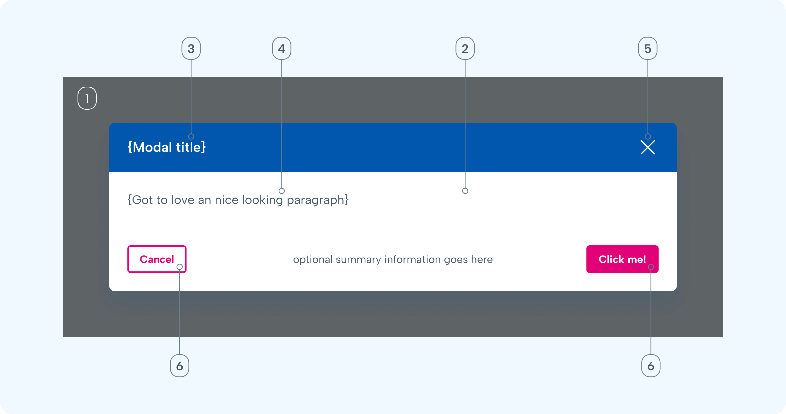
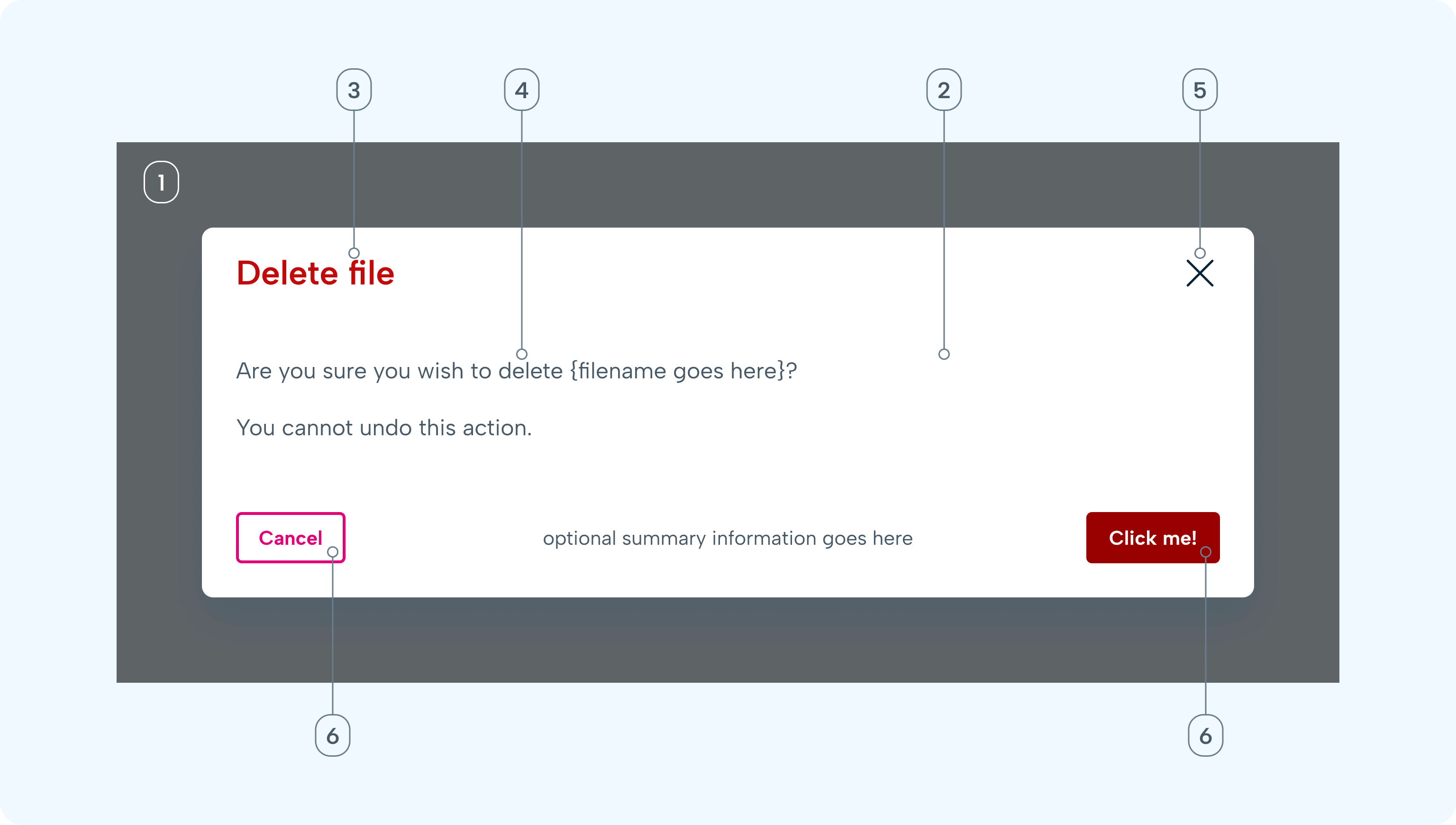
- Backdrop: Transparent overlay that contains the modal dialog.
- Container: Modal dialog container.
- Title: A question or descriptive phrase that conveys an overview of the purpose.
- Message: Text content indicating the purpose and potential next steps.
- Dismissal: Button element to dismiss the modal.
- Actions: Buttons used to provide explicit action(s) the user can take to either close the modal or continue with a task.
Variants
Standard Modal
- Typically used for notifications or simple choices
Confirmation Modal
- Short, direct message with clear affirmative/negative options (e.g., “Delete”, “Cancel”)
Form Modal
- Includes fields for user input
- Often includes validation logic
Full-screen Modal
- Occupies the entire viewport
- Ideal for immersive tasks like wizards, settings, or multi-step workflows
- Close icon and breadcrumb or progress indicator recommended
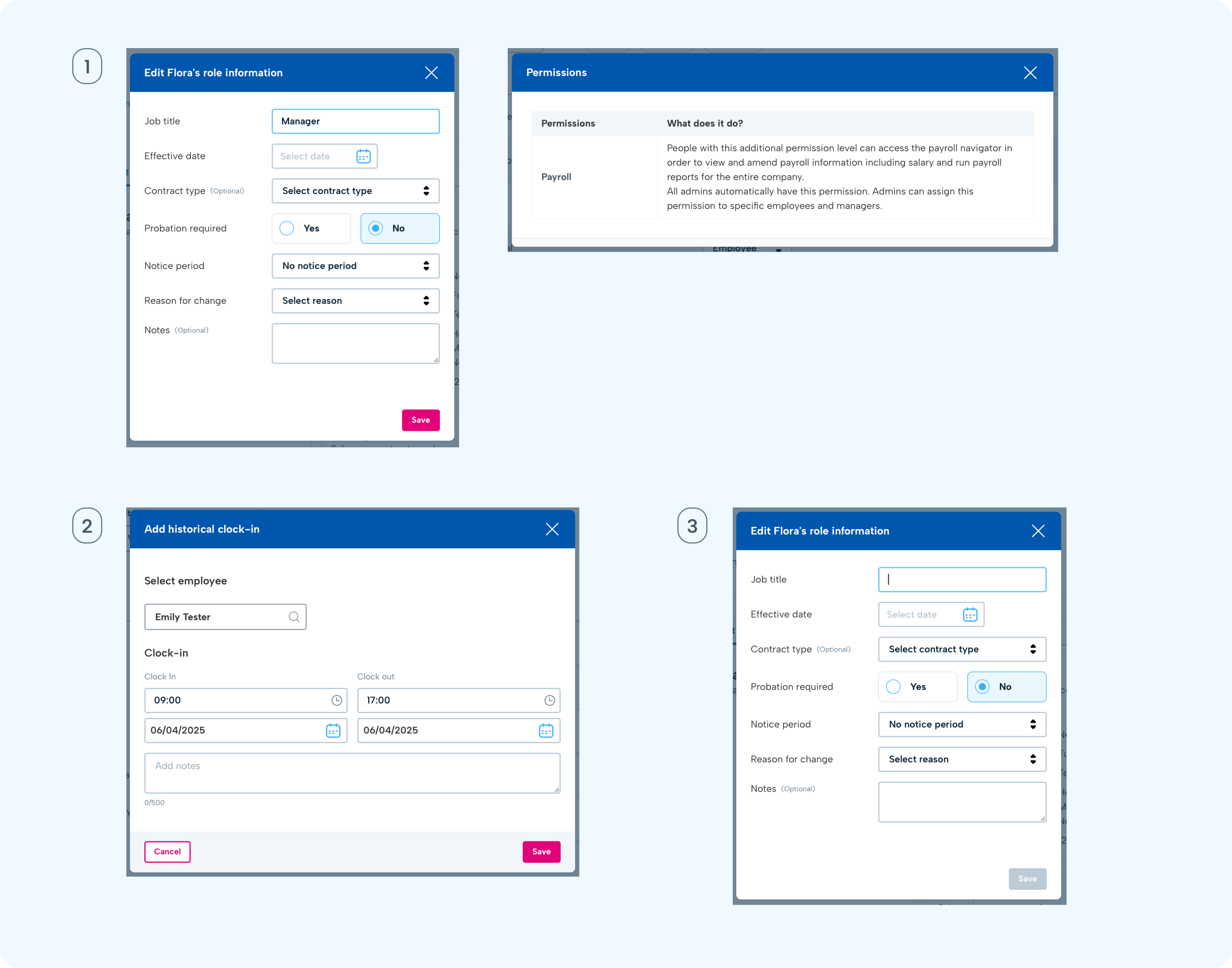
Multi-step Modal
- Used for progressive disclosures (e.g., change contract, edit place of work)
- ncludes a step indicator, “Next” and “Back” buttons
- Optionally supports validation per step
Sizes
- Extra Small (xs) – 360 px
- Small (sm) – 540 px
- Normal (base) – 740 px
- Large (lg) – 900 px
- Extra Large (xl) – 1280 px
GUIDELINES
When to use
- For necessary actions outside the main flow.
- When the action doesn’t benefit from the context of the current screen.
- To interrupt the flow and force attention.
When not to use
- When you have only a single simple action—use a dialog.
- For little information that doesn’t disrupt the main flow—use a popover.
- For a temporary message without actions—use a toast.
- Don't nest modals within modals
- Don't use modals for large amounts of text or data
Button position and guidelines
- If there is only one button on the modal footer, position it at the bottom-right. If the button is "Close", it can be handled by the top right "X" button.
- If there are two action buttons, position the primary action on the bottom-right (e.g., “Save”, “Confirm”), and secondary or cancel action on the bottom-left.
- Dim the primary button if all required information is not completed.
- Avoid too many action buttons (2–3 max)
INTERACTION & BEHAVIOUR
Open on user action
Modals disrupt the main flow. If they come as a surprise, they’re more likely to be dismissed. Only open a modal after the user has taken an action so it’s clear why it was triggered.
Direct user with the title
A modal title sets the context for everything inside and also stays fixed at the top if the modal scrolls down. So the title should make it clear what the modal relates to and what actions might be expected of the user. Keep it short and focused on either an action (verb) or a category (noun).
Allow users to close
Users want to feel in control of their actions. Since modals act as interruptions, they can invoke negative feelings in users. Make sure users feel in control by offering them a clear option to close the modal and get back to the main flow.
Modals should always include a close button in the footer (with a name appropriate to the situation).
If you have a primary action in the modal footer that results in a system change, then you should have a Cancel button. If the modal is providing information and there is no action to take, you should have a Close button.
If there is only one option and it's ‘Close’ (not a primary action) then the close function can be handled by the top right X, and buttons in the footer are not mandatory. Desktop modals should include a close button in the upper right unless you need an explicit close (such as for cookie consent).
The option to close the modal by clicking the overlay is only applicable for informational or non-critical modals (eg. Welcome, Subscribe now). Do not allow overlay dismissal if the modal requires confirmation, data input, multi-steps or explicit acknowledgement.
Scroll Behaviour
Disable background scroll when modal is open. Internal modal content can scroll independently.
Empty or Loading States
If your modal loads content dynamically:
- Show a loading spinner with a clear message (e.g., “Fetching details…”)
- Handle API errors inside the modal: “We couldn’t load this content. Please try again.”
CONTENT
Clear and focused content is essential to making modals effective. Unlike full pages, modals are interruptions — they should be quick, purposeful, and easy to act on.
General Principles
- Be concise: Use the fewest words necessary. Aim for clarity over cleverness.
- Lead with purpose: Start with the most important information or question.
- Prioritise scannability: Use short paragraphs, bullet points, and clear headings.
Modal Title
- Describe the purpose of the modal. Keep it short (preferred in 1 line).
Body Content
- Explain the context or consequences in short sentences. Phrase it clearly if a decision is needed, e.g. “This action can’t be undone.”
- For input modals, keep forms minimal and ordered logically.
Action Buttons
- Provide clear differentiation between primary, secondary and danger actions.
- Use verbs and label clearly: Action-driven labels help users understand what will happen. Buttons should describe the action, e.g. “Save Changes”, not just “Yes”.
- Avoid generic terms, e.g. “OK” isn’t helpful unless context is very clear.
ACCESSIBILITY
Keyboard Navigation
- Tab and Shift + Tab cycle through focusable elements.
- Modal opens with focus on first input or action buttons.
- ESC closes modal.
Screen Readers
- Ensure modal content is read as a single context.
- Do not read background content when modal is open.
MOBILE CONSIDERATIONS
📱 Mobile Considerations
Designing modals for mobile screens requires special attention to usability, readability and interaction. On mobile, modals should feel natural and not obstructive. Keep it simple and minimise steps.
Width and height constraints - For complex modals, it can expand to the full width of the screen (100% width). Max-height should be ~90% of the viewport height. Use scrollable internal areas to keep important actions visible.
Keep content short and focused - Don’t use multi-column layouts. Avoid requiring landscape orientation.
Keyboard awareness - modals that include input fields must account for the on-screen keyboard. Ensure that inputs are not hidden behind the keyboard and the modal scrolls to bring active fields into view.
Touch target sizes - Close buttons, inputs and action buttons should follow mobile tap area standards (at least 44x44px). Add extra padding around tappable elements if necessary.