Tabs
OVERVIEW
Definition
Tabs divide content into different but related sections, allowing users to change views without leaving the page. Tabs can be used on full page layouts or in components such as modals or cards.
Live demo
Anatomy
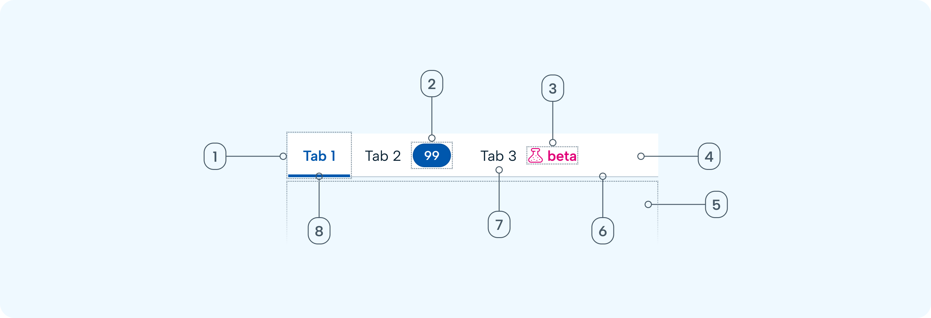
- Tab: Contains text label and badge
- Badge (optional): Counts the number of items, or number of items needing action within the tab panel
- Beta badge (optional): Display for beta features
- Tab group: Contains all tabs
- Tab panel: Contains the content related to the active tab
- Divider: Line to help define the tab panel
- Label: Text representing the content of the tab panel
- Active indicator: Highlights the active tab
Variants
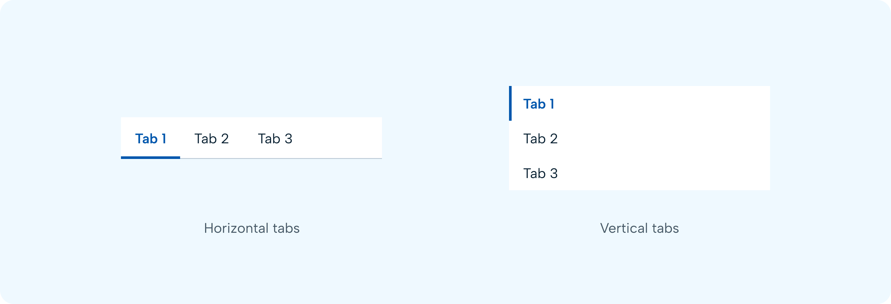
Horizontal tabs
Horizontal tabs are highly flexible and can be used for full page layouts or nested within other components, such as a modal or header. To help define the tab panel (content area below the active tab), a divider line is used that extends from the tab group to the end of the panel.
Vertical tabs
Vertical tabs are left and vertically aligned tabs that allow users to scan through information from top to bottom.
GUIDELINES
When to use
To help reduce cognitive load, use tabs to categorise related information into different groups. Tabs can be used to organise content such as forms or settings, so users do not have to navigate away from their workflow to complete their task.
When not to use
- Avoid confusing tabs with navigation. Tabs help users remain in the same context; use navigation for changing context.
- Tabs should not be used if users need to compare information from multiple groups, or if contents should be viewed at the same time. This would result in users having to click back and forth to complete a task. Consider using an accordion instead.
- When toggling between different formats or views of the same content, use segmented control instead. Segmented controls can be used alongside tabs to organise related information within the tab’s contents.
- Don’t use tabs for sequential content that needs to be read in a particular order. If users need to work through a linear process, use wizard instead. Tabs don’t support progressive tasks, it is entirely flexible how their contents can be consumed.
Layout guidance
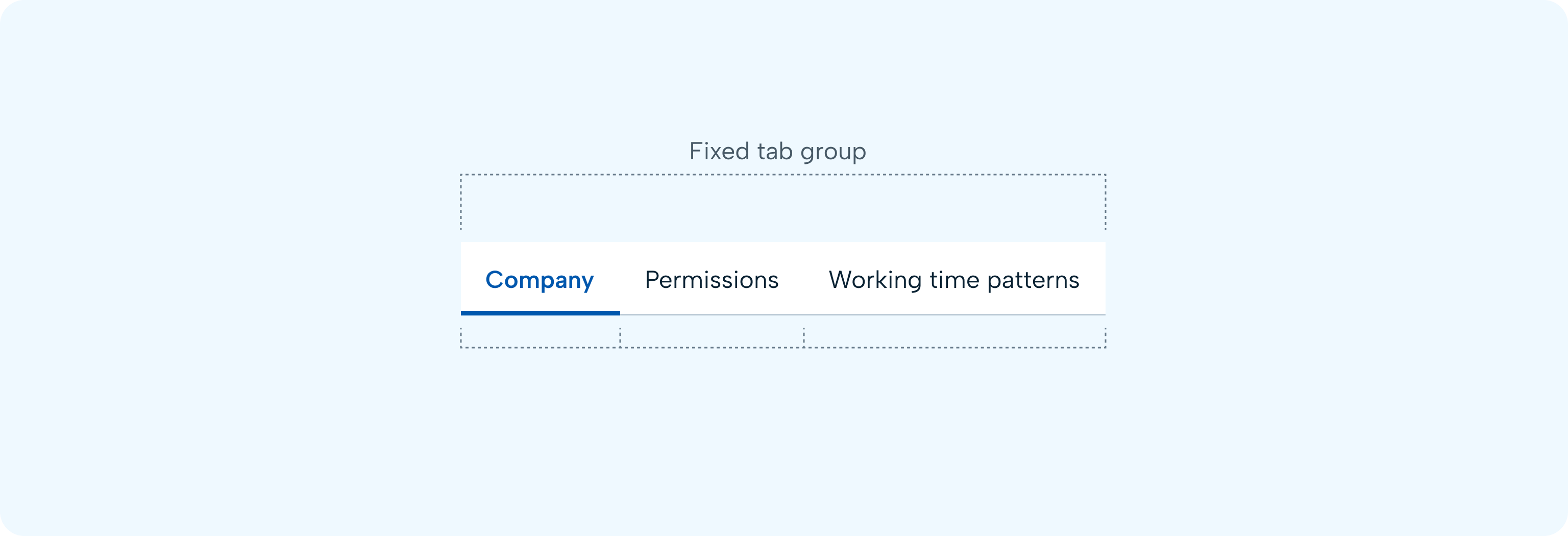
Fixed tab groups
Currently, our tabs are displayed in a fixed layout on the screen. The component doesn't support scrollable layouts. However, each tab will be a different size depending on the label’s character count but will have consistent padding on each side of the label.
Number of tabs
Do not use too many tabs in a tab group. It can lead to cognitive overload, making it hard for users to decide which one to select. A long list of tabs can also appear messy and confusing, impacting the overall visual appeal of the interface. For web, use maximum 5-7 tabs in a tab group.
Always show horizontal tabs in a single row. Using multiple rows of tabs will make it hard to relate the tab with the content. If your design requires a large number of tabs to be placed at the same level, it is better to organise content in multiple hierarchy levels or consider other navigation patterns like a vertical navigation bar.
📱 Mobile Considerations
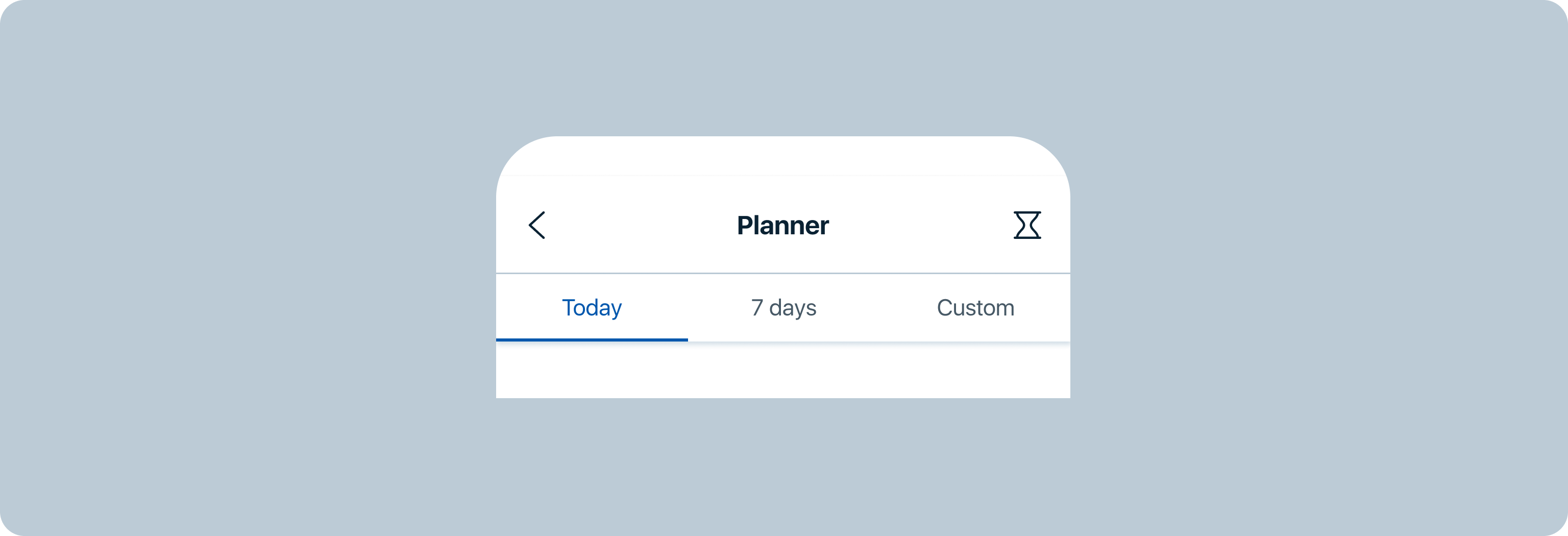
- The tab group container should always extend the full width of the screen and be divided into equal sections, one for each tab.
- Avoid using more than three tabs at once. At four or more tabs, the container becomes cramped.
Nested tabs
Avoid using nested tabs as it makes it difficult to relate the content within each tab and its nested tabs. If you need to organise content in nested tabs, consider using different visuals or another design pattern, for example placing the content of each subcategory into accordions instead.
Modifiers
Badges

Badges containing a count can optionally be used on a tab to indicate a number of items within that tab panel. This can be useful to give context to the contents of a panel that isn't currently being displayed. Limit badge content to four characters, including a "+".
Once the user views the relevant content in the tab or performs a predefined action within the tab, the badge value should update or the badge should disappear entirely.
The style of badges in tabs is inherited from the badge component statuses (dark background version):
- default
- information
- success
- warning
- error
- notification
Beta badge

Beta badge can be displayed in tabs to indicate a beta feature within the tab's contents.
Icons
![]()
A leading icon can be displayed for each tab. However, our preferred approach is to not use icons in tabs, especially in tab groups containing more than 2-3 tabs.
Do not use tabs with both icons and text labels on only some tabs, but not others.
BEHAVIOUR
States
Tabs have two main states—selected and unselected. Other interactive states are hover and focus.
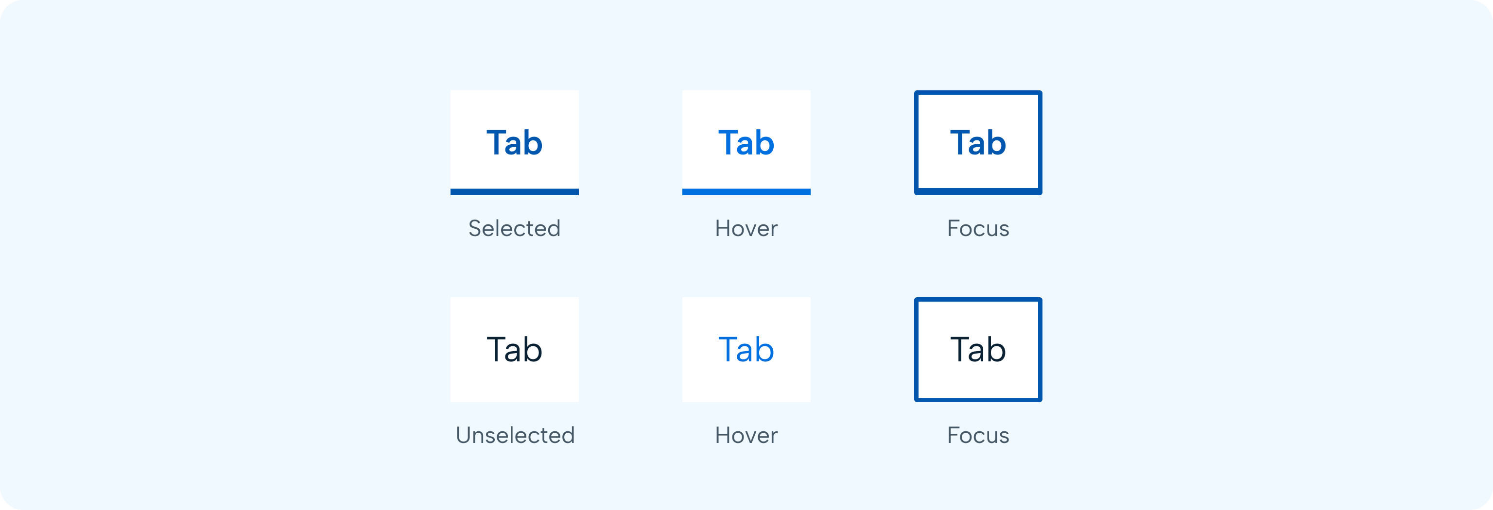
Interactions
- There are always at least two tabs in tab groups.
- One tab is always selected by default – usually the first tab.
- Only one tab can be selected at a time. When a user chooses a new item, the previous tab is automatically deselected.
- A tab reveals its associated content (tab panel) when selected.
- If a user navigates away from a tab, it remains the selected tab until altered by the user.
Tab switching
Tab switching needs to be a seamless experience for users. Do not load the entire page when the user switches a tab. Users must not wait for the content to be loaded every time a tab is switched. If data is coming from a back-end server that will take time, make sure to display a loading state in the tab so that the user can get the necessary information and not leave the application.
Tab URL
Each tab at the parent level should have its own unique URL. When determining whether to implement unique URLs for child tabs, consider whether or not a user would want to bookmark or link to the tabbed content.
CONTENT
Keep content similar
Tabs make sense when the content they contain is related. That includes categories within a list, one specific task, and parts of a user profile.
Don’t use tabs when the content isn’t related. Make sure it all makes sense within the overall context.
Make content clear
Users want to know what each tab contains before they switch to it.
Tab labels should clearly and succinctly describe the content of the tab they represent. Tab content should contain a cohesive set of items that share a common characteristic. Use short, clear names to set clear expectations. Aim for a single word when possible, do not truncate text.
Tab labels should be nouns - the name for the content that is in the tab - and not verbs.
ACCESSIBILITY
- Tabs must be keyboard accessible, with a sensible tab order to enable users to move between selections.
- The current selection must be clearly indicated.
Keyboard/Switch
Use manual tab groups which allow the user to arrow between the tab items without updating the tab panel underneath. When the user right arrows, the initially selected tab remains selected while focus moves to the next tab. In order to select the next tab (and update the tab panel under the tab), the user needs to press Enter/Space.
Initial focus
On arrow/tab in a tab group, the active indicator appears on the first interactive element, providing feedback to the user that it is selected. The user is then able to tab to additional interactive elements until all available items are complete within the tab group.