Force update
Overview
The force update pattern must only block access when critical bug fixes require immediate patch-level updates.
Definition
A forced update is a mandatory update to software that users are required to install before they can continue to the app or system.
Live Demo
[Add Storybook]
Anatomy

- Banner: Prominently displays the logo, tagline and application version.
- Logo: reinforcing brand identity and user confidence.
- Container: screen dialog container.
- Alert Icon: A critical communication that signals something requires the user’s immediate attention before they can continue.
- Title: A question or descriptive phrase that conveys an overview of the purpose.
- Message: Text content indicating the purpose and potential next steps.
- Actions: Button used to provide explicit action the user can take to either close the modal or continue with a task.
Variants
Banner logo
- Use the correct application logo depending on which app the force update applies to. This reminds the user who the update is from.
Sizes
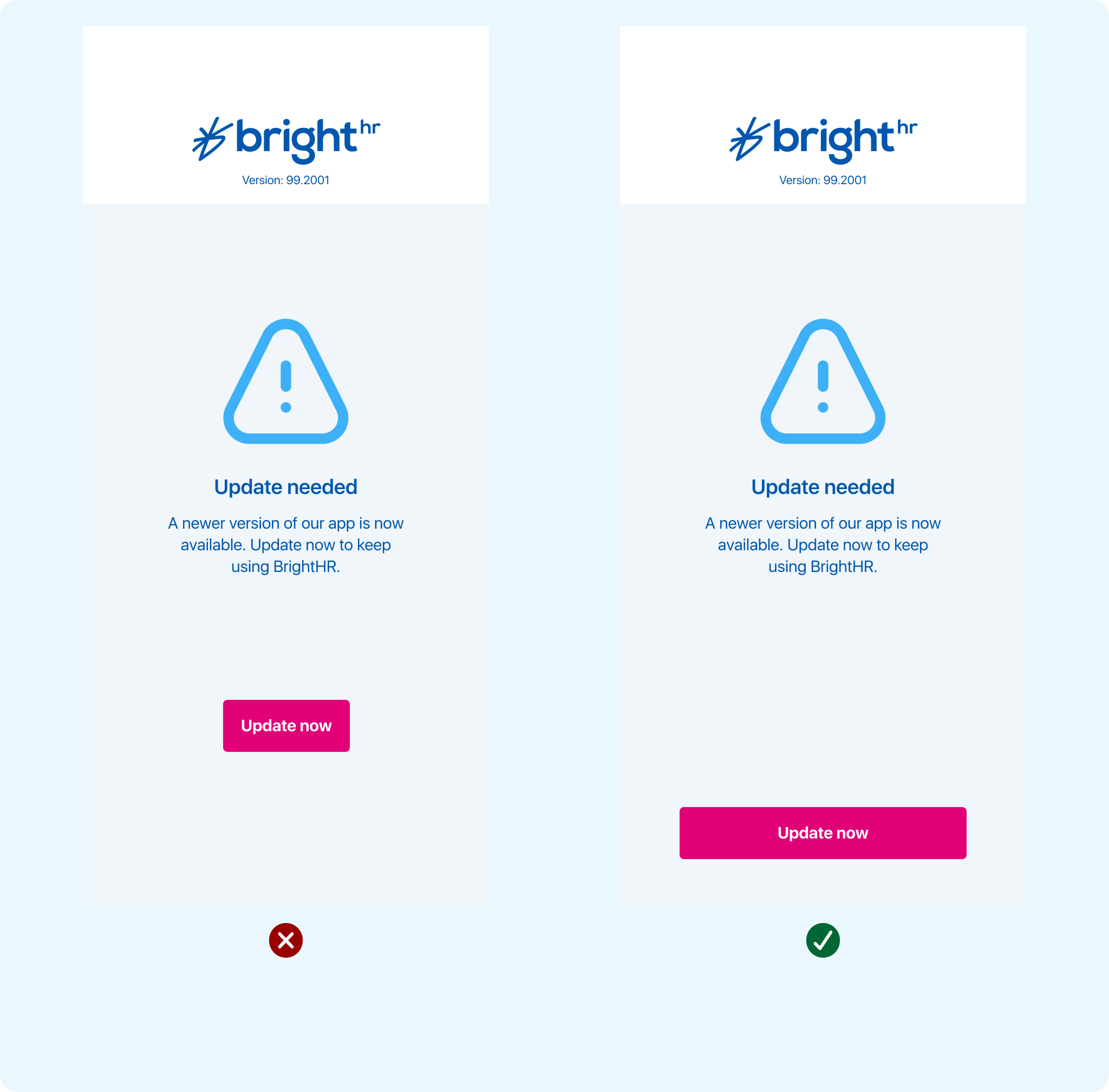
Button sizing should be in alignment to the main component width of the body text. This changes between mobile vs Ipad / tablet
Mobile
- Base - 265px
Ipad / tablet
- Base - 320px
Guidelines
When to use
- Within Bright Apps only
- When an app must be updated before the user can continue to use it.
- A new version of the app is released and older versions are no longer supported.
- To fix critical bugs or security changes within the app / software.
When not to use
- After auto - update or re-download
- If the update is already applied, don’t show the force update splash again.
- Not during a critical user flow (example; don’t interrupt uploads or form submissions)
Button Position
- There should only be one CTA in the force update screen / overlay
- Use primary button at base size
- The button should be positioned at the bottom centre of the screen between 32 - 44 px up from the bottom of the screen
- Avoid multiple action buttons, the update button in this instance should be the only action button for the user to interact with.
Behaviour
Display on interaction
Force update (when required) should appear on app launch / resume and disrupt the user from continuing within the app dashboard.
Inform user with title and Icon
An informative title sets the context for the body of the message within the screen. Keep it short and focused on the action the user needs to take. The alert icon reinforces to the user that this requires their attention and that an action is needed before they are able to continue.
Direct user with call to action
If the user taps on the primary action button within the screen state, The user should be taken directly to the app store to trigger the update.
There is no option to close the app or click away from the update screen. The update trigger and force update screen should remain when a user resumes until such a time that the user updates to the latest version on the app.
Content
Clear and concise content is essential to minimise user friction and interruption during a force update.
Title
- Describe the purpose of the screen the user is seeing. Keep it short.
Copy Content
- Information about why the user needs to complete a force update allows the user to check the network or switch to wi-fi and gives the user control of when to trigger the app store redirect.
- Explain why the update is needed, keep it short and positive.
The below copy has been defined and should remain the same for each critical update: "A newer version of our app is now available. Update now to keep using BrightHR"
Action Buttons
- Only use the primary CTA
- Label the CTA clearly with direct instruction that helps users understand what will happy next. e.g “Update Now'
Accessibility
Screen reader compatibility
Semantic labelling (e.g ARIA label) allows screen readers to announce the update message, buttons and any warnings to users who rely on audio feedback.